In the final dark months of 2020, a small group of people in the Denver, Colorado area quit their jobs and decided it was time to launch a new church. Through mask mandates, social distancing, and group restrictions, they somehow made it happen in a matter of weeks. One of the first steps in this journey was to figure out branding and identity. They knew who they were and who they wanted to be, so most of it came natural. Kindred Called me up, and filled me in. I got started on concepts and presented them a short-while later.
Community means everything to them, in their words, "We belong to each other". The team wanted something approachable and modern— just like them! After brainstorms and rounds of edits, we landed on the final logo. Some say it resembles a row of houses, reminding them to love their neighbor and of course bringing them right back around to their core value statement. Other say it's a crown, drawing them back to their truth of belonging to God. Kindred Church, you were so fun to work with, I can't to see all the good that you bring into the world!
Final Logo by Lauren Hart
Final Mission Statement
Sometimes all you need to start something incredible is some scribbled words and a clear mission.
The team knew their name—Kindred Church, and they knew their tagline/ descriptive words. They knew they wanted something black and white that would stand out on a sticker.
Since they were on a tight schedule it was only about a week later that the first round of concepts were in their hands. Their team looked them over, and decided on two that fit their style. I completed another round of edits, and gave them the new iterations. And that was it! They chose their logo and got to begin the real work of planting a church.
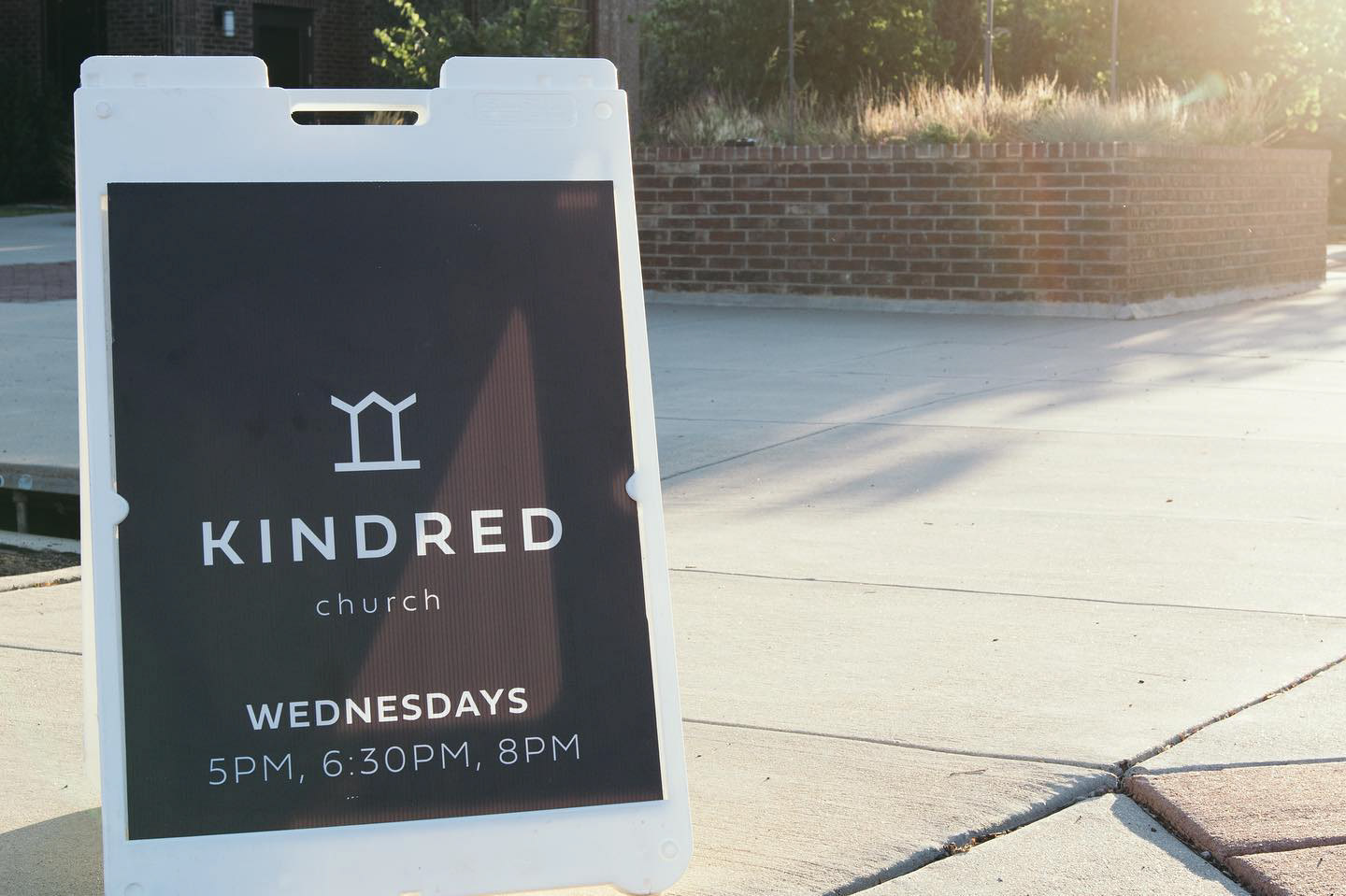
Photo owned by Kindred Church
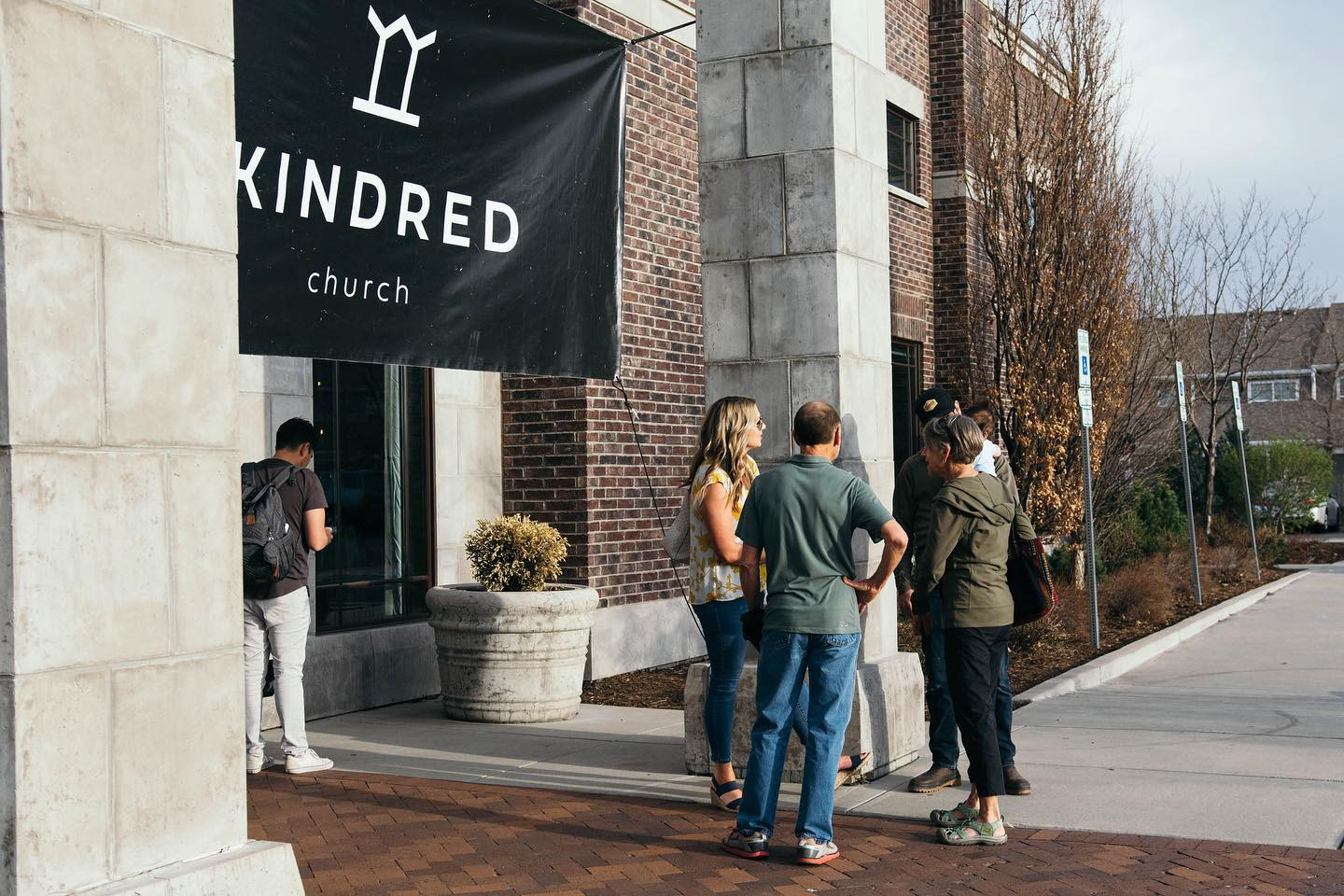
Photo owned by Kindred Church

Photo owned by Kindred Church

Photo owned by Kindred Church
T-Shirt designs were also included in the branding process!
Photo owned by Kindred Church